Sagrat Cor Sarrià
Project
Sagrado Corazón Sarriá is a state-subsidised school at all stages. It is of a religious nature and its ideology is based on Christian values and the spirit of the Congregation of the Sacred Heart, which has educational centres all over the world. It is a school with a very solid history, founded in 1846.
We have redesigned the website, which includes the corporate website, the online shop and the Training Cycles website. As well as several communication campaigns, branding, community management and digital marketing.
Client
Sagrat Cor Sarrià
Rol
Web design
Branding
communication
Editorial
graphic design
digital marketing.
Data
2020-2022


Brandbook
The corporate identity of the school is worked on to develop a brand manual that includes the good practices and all the rules of the school.


The different versions of the logo
The main version of the Sagrado Corazón Sarriá logo is based on the architectural form of the school’s main façade, and reflects the following values: professionalism, formality, functionality, sobriety, stability and security.


The social or commercial logo
From the union of the two “S” of the words “Sagrado” and “Sarriá” comes the symbol that reminds us of the shape of a heart and unifies the values that the school wants to communicate: familiarity, commitment and proximity.
The combination of the two corporate typefaces, a modern serif typeface and a highly legible dry stick typeface, provide solvency and at the same time modernity and innovation.


Corporate website
In order to redesign the corporate website, a large part of the corporate identity has been developed. Including some geometric elements, some rectangles in the form of coloured lozenges that provide light and a network of dots with the corporate colours.
The website consists of many pages, including all the information about the school and the offer, the facilities and services, the activities, the AMPA and the job opportunities, among others.
All pages breathe professionalism, functionality and seriousness, which are some of the values that the school represents.
Even so, thanks also to the photographs of the students, teachers and the day to day life of the school and the different graphics and iconographies, the site ends up being dynamic and attractive.
Web Online Shop
+ Social Networks
A functional and understandable site is proposed where you can consult which products, at what price and how to buy them.
A logo is created for the Online Shop and colours similar to the corporate colours but with more light are established. These will be accompanied by abstract geometric shapes which will also be used to create the creatives for the Social Networks.


Campaign
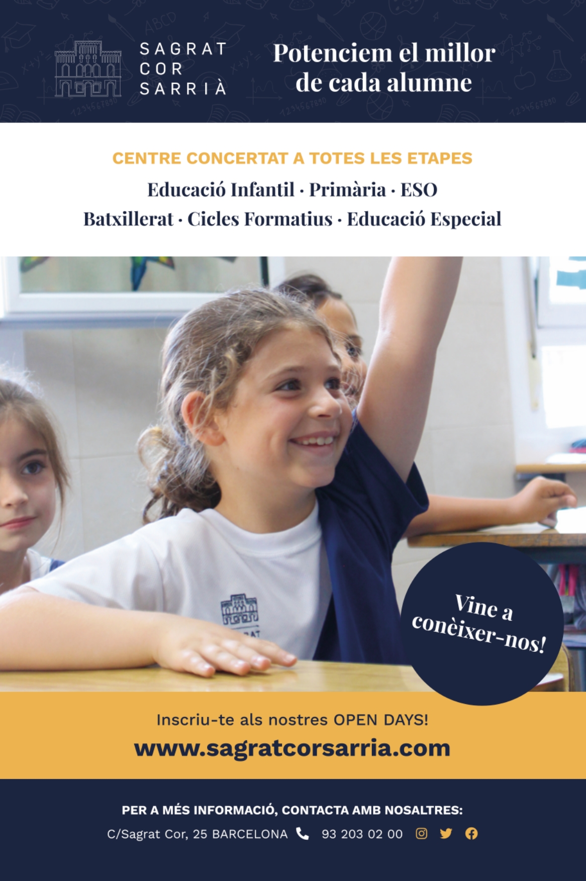
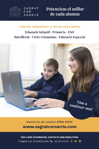
Open Days 2022
The Open Days 2022 campaign aims to show the school to an audience of families interested in a quality, international education where the best of each student is promoted.
This campaign could be found on Metro and FGC billboards and also on some bus lines in the city of Barcelona.


Campaign
Formative Cycles
The campaign for Vocational Training Cycles was aimed at an aspirational and motivational slogan. It was aimed directly at prospective students, concerned about their future.
This campaign could also be found on the Metro, FGC and some bus lines in the city of Barcelona.
Stationery
For the Open Days campaign, specific leaflets were also designed for each educational stage and each training cycle. These were given physically to families who came to visit the school, so that they could take away an informative document.


